This is an archival copy of my PhD blog, which was active between 2009–2015. I'm publishing it again as a personal time capsule, but also because I think it's an interesting documentation of the PhD process itself, which might be useful to someone, somewhere. – Chris Marmo, January 2026

Dissecting cities

Armelle Caron has started a project dissecting the grids of cities, and laying them out linearly. The above is a picture of every single block in Paris. New York, Istanbul and Berlin have also been dissected. It’s a really interesting way of visualising the complexity of the city and it’s network of streets, walkways and alleys. It’s amazing how many of them look like faces to me.

Thanks to Owen for pointing this out!

Open Source Timelines

Timeline is an open source project that allows you to create a HTML5/jQuery timeline from a set of data. It is powerful enough to accept JSON as a data source, but it also works straight off a google docs spreadsheet. Play around with the included templates, and you get a clean looking slide show with a time control beneath.


Check out the user interface timeline.

It appears to work well with twitter, youtube, flickr and a few others. I’m planning on playing around with this as a way of communicating some of the qualitative data I’ve collected over the last year or so. It’s a shame there’s no interface (beyond a google spreadsheet) for building your own timeline; I imagine this to be a very powerful story-telling tool if provided to the right people, and with easy access to the media objects they care about. Of course, some kind of location integration would be nice too.

As a side note: I find it really interesting that even something that’s been traditionally technically inclined – like an open source project – uses phrases like “beautifully crafted” and “intuitive to use”. Does it represents a shift of focus towards user experience and design, or is it just a healthy dose of Apple-isms? 

Personal Geographies

Personal geographies is a term I’ve been using in (thus far private) writing and preliminary analysis of diary studies and interviews I’ve conducted with park rangers. The above picture is the result of combining a particular kind of personal geography – jogging trails through New York city. It’s also an increasingly common type of visualisation; the visualisation of movement to emerge the shape of a space. Twitter heat maps and flickr overlays are also in vogue (not that that’s a bad thing!). The best thing about personal geographies is that, when combined, they form social geographies; the sense of place that has arisen through a community’s interaction with the city. What the visualisation above shows is a particular interpretation of a place, and one that was not necessarily deliberate.

This is also another example of digital data imposing itself on the physical world – it’s becoming increasingly easy to access the data in the digital layer above us. The seams between digital and physical are blurring too; as this example shows, our physical being in the world increasingly generates digital data, without consciously creating “content”. Conversely, the act of deliberate “generation” of content can influence our physical space and the actions we take in them. At the most basic level, think foursquare check-ins influencing which bar you go to.

We’re already living in a hybrid physical/digital world – and they’re increasingly influencing each other in ways designed or not. In fact, the duality of physical and digital may be a generational divide – in 100 years (less?), it will most likely sound comical to separate the two.

Link: Drawing New York

Virtual Spaces

One of my favourite blogs at the moment is UrbanTick, run out of University College London. It’s a good mix of technology, architecture, environments and of course, people. It particular its a great source of geographical visualisations: representations that sit at the intersection of all these things.

Visual Cities is my latest discovery through that blog – visualising geocoded twitter and flickr data. Its creator states: “By revealing the social networks present within the urban environment, Invisible Cities describes a new kind of city—a city of the mind”.

This touches on what I think is the core of my phd: the representation of knowledge about locations – that the world that exists in our minds, and the one that is created socially, is not necessarily evident in the environment, but exists physically on servers across the world, and virtually in a meta-layer above our heads.

One interpretation of ubiquitous computing is that there is potential to incorporate this information back into the environment, removing the dissonance between space and our understanding of it. Visualisations are a step towards that: towards making the abstract tangible and actionable.

Reuben, who I’ve been working with for a few years on a number of things, also talked about this and built his own simple geo-visualisation for the iPad, framing it as an “historical narrative”.

Together we’ve been building a tool that will allow people to create their own meta-data about places, and collectively manipulate and interpret this data to create knowledge. The more I think about the different strands of my research, the more I see them converging. After about a year of fuzzy directions and more questions than answers, its relieving to see a somewhat clear path is emerging.

Thick Description

This week I finally received my ethics approval. For those who haven’t had to deal with an university ethics committee before, it’s a notoriously lengthy and tedious process. I managed to have my research methods approved within 3 months, which is about half the time it took my research partner – so understandably, I’m pretty happy!

As part of the ethics submission I essentially planned out every stage of the hands-on research I’ll be conducting with park rangers. I’m relying heavily on qualitative methods to uncover the behaviour, goals and habits of park rangers as they go about their jobs – focusing on who they communicate with, what information they impart and use, what decisions they make, and how all of this related to their notion of location. Essentially, I’m treating park rangers as a community with their own set of practices, and, through qualitative research, am hoping to uncover deeper links between themselves and the spaces they manage.

Thick description

A key aspect of almost all qualitative research is the notion of “thick description” – a term that appears in just about every text book on the subject. However despite it’s seeming importance, it’s a notoriously difficult concept to define. There have been numerous attempts, as documented in Joseph Ponterotto’s paper from 2006 (reference below).

In 1973, Geertz was the first to use the term in relation to qualitative research, and states the following:

From one point of view, that of the textbook, doing ethnography is establishing rapport, selecting informants, transcribing texts, taking genealogies, mapping fields, keeping a diary, and so on. But it is not these things, techniques and received procedures that define the enterprise. What defines it is the kind of intellectual effort it is: an elaborate venture in, to borrow a notion from Gilbert Ryle, “thick description”.

Denzin (1989) attempts to define thick description by comparing it to “thin description”. According to Denzin, thick description has the following features:

“(1) It gives the context of an act; (2) it states the intentions and meanings that organize the action; (3) it traces the evolution and development of the act; (4) it presents the action as a text that can then be interpreted. A thin description simply reports facts, independent of intentions or the circumstances that surround an action. (p. 33)”

Other definitions essentially equate it to doing ethnography – in that, the actual nature of ethnography is to gather thick descriptions. This is the most common link between the definitions – essentially, like ethnography as a practice, “thick description” can be said to provide context and meaning to observed actions, rather than simply recording the occurrence of an event in isolation. It’s more about recording the story of a fact, rather than the fact itself.

There are a number of ways to achieve the type of data that might be defined as “thick” – participant interviews, field observations, analysis of personal spaces and artifacts, and more. Diary studies are another well documented form, as part of a broader notion of a “cultural probe”. This is one which I intend to use with park rangers.

There’s an app for that

Thick Description

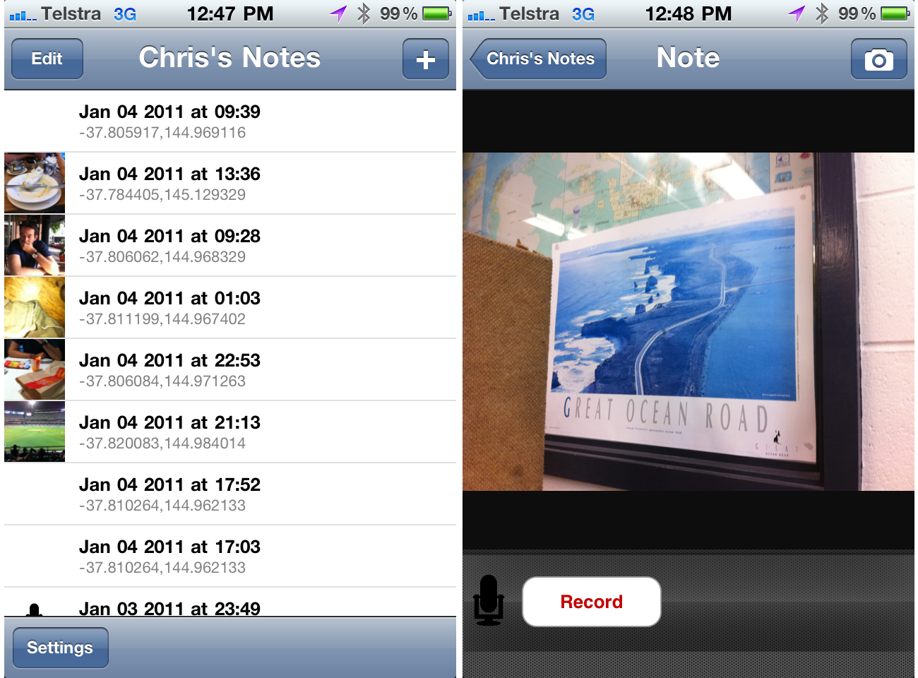
To this end, and given the extra-special role that location plays in my research, Reuben and I have built a custom application for park rangers, that asks them to provide thick descriptions of the locations they manage.

The application is mobile based (iOS specifically), and relies on a combination of GPS, photography and audio descriptions to gain a subjective sense of the spaces and places rangers make decisions about.

Each entry into this diary app is time-stamped and can be any combination of coordinate, photo and audio description. It’s this combination of audio and visual input that is the most powerful – given the nature of a park rangers job, audio descriptions are the most effective means of capturing the actions of rangers, and one that matches their current behaviour more closely than text based descriptions.

The goal is to create a low barrier to entry for rangers wanting to talk about their jobs as they’re doing them. Rangers will then be allowed to self-categorise/tag entries ex situ, before being visualised and used as discussion points in follow-up interviews.

The above screenshots are from the first functional version of the app, with many more improvements (particular design) to come.

Focusing the diary

To help guide the use of this application, we’re providing rangers with a set of guidelines on what types of information and input we’re interested in. Broadly, we’d like them to capture their interactions with other rangers, the decisions they make, the information they use in making these decisions. Given the role of location in all of these research questions, their entries will be analysed and visualised on maps to allow them to comment on the relationship between themselves and their environment.

We want to make this a fun activity for rangers, and we’ll be conducting kick-off sessions, and I will be following rangers into the field regularly to make my own observations and hopefully help overcome any confusion about the study before rangers are left alone with the application.

Wrap up

Thick description is a key part of the qualitative research I will be conducting with rangers at Wilson’s Promontory national park – I hope to uncover deep relationships between the rangers themselves and the locations they manage. As part of a much wider research program, we’ve designed and implemented a location-based diary study tool that will allow us to conduct remote research to be used as probes for further interviews.

Next for us is to build a visualisation interface for all this data – one that will allow us as researchers a way of making sense of qualitative data about locations, but one that will hopefully provide the basis of a knowledge management tool for Parks Victoria themselves.

References

Please note that the links below are to purchase the references I use in this post on Amazon. If you do find them interesting and decide to purchase them, I collect a small commission. Doing so will help support this blog (and my research!) in a small way, and I will be very grateful!

The beginnings of paris

I’m currently knee-deep in another conference paper – this one to be submitted to ICA Conference in Paris, 2011. If accepted I’ll be heading there in July. That’s the bread-stick of motivation currently being dangled in front of my buret-adorned and stripey shirted self.

To be honest, even without the Eiffel Tower looming, I’d still be reading and writing about this right now as context-awareness has captured my imagination. I’m working towards a first draft of the paper today and over the weekend, but I thought I’d post the introduction here for feedback on its direction.

Read more

Visualisation documentary

Visualisations are a powerful tool when it comes to helping us make sense of data. Exploiting our perceptual abilities is a very efficient means of finding novel and interesting relationships and patterns in data that we simply don’t notice when staring at the raw numbers.

The following documentary discusses data visualisation and why it is becoming extremely important: Data is now free and ubiquitous; the skills, tools and insight required to make sense of that data is now the rarer commodity.

GeoCart’2010 Presentation

Today I gave a talk about the role of GeoVisualisation in making sense of location based information at GeoCart’2010 in Auckland, New Zealand. It was well received and I got some tough questions from the audience afterwards – always a good sign.

I’ll post a link to the paper I wrote a bit later on, but hopefully the slides are fairly self explanatory!

Location is not enough

Progressing on from my previous post regarding the subjective nature of locations in a National Park (i.e. that rangers view places differently from each other and that their views may also change over time), I have written something in the conclusion of my OZCHI paper that I think hits the nail on the head. Location is not enough – location is just a coordinate. The question is, how can you infer the context that exists between a location and the person? Why is that person in a place and what are they hoping to do there?

Here’s the part from the paper. If you’d like the references mentioned just let me know:

Geovisualisation is an important tool that assists in the analysis and discovery of information amongst the plethora of location-based data we now have ready access to. The act of visualising data is repaid exponentially in terms of cognitive savings (Larkin & Simon, 1987), and can lead to the formation of deeper and better quality understanding about a problem domain (Lowe and Bouchiex, 2008).

However, the subjective, social nature of knowledge does highlight the importance of people in the ecology of sense-making and knowledge discovery – it is important not only to understand how people will interact with geo-visualisation interfaces, but also how they go about generating and absorbing knowledge from their existing social structures; that is, how they share and communicate with each other.

Any intelligent interface designed to meet the needs of the current research project should not only be concerned with the display of location-based data, but it should also be aware of the social and environmental contexts in which it is being used.

Subsequently, it is not enough that data being displayed be tagged with a location in the form of GPS coordinates. From a machine and computational perspective this is the necessary first step towards providing information about a place, but from a human-interaction perspective the display and dissemination of this data needs additional context. Simply: a person may be in the same location for entirely different purposes, and an intelligent location-based service needs to be aware of this purpose.

Geovisualisations are an important tool for the sense and decision-making processes, but it is the role of the holistic design of a system (that includes geovisualisation) to infer a better quality understanding of the goals and motivations of a user based on their location. It is hoped that further research in this project will provide insights into how location can be augmented with this further context, and how geovisualisation can assist users to explore this.

I think I’ve latched on to a new take on the project, but I need to do more reading into ubicomp and context-awareness to get a better understanding of what work has already been done in this space.

Any suggestions? Thoughts? Thanks!

OZCHI ’10

I’m submitting a short paper to the OZCHI ’10 conference held in Brisbane, Australia. Here’s the abstract put together with the help of my supervisors:

The proliferation of consumer electronics devices that are Global Positioning System (GPS)- enabled has led to an increase in the availability and quantity of data that is geo-located. The position of where certain data has been captured, photographs taken, or places visited can be easily and quickly appended to files generated by a portable device. Related to the capture of information and the subsequent geo-coding has been the need to visualise this data.

Geovisualisation, the viewing of geographical data and representations of geography (maps) through the frame of location, has become an important method for sense-making and knowledge discovery. Recent research in this relatively new field has positioned it as being more akin to “geovisual analytics”, with an emphasis on the cognitive elements of exploration of data through highly interactive interfaces rather than a simple static display. This repositioning highlights the importance of the human elements of interaction with geo-based data and the interfaces designed to present them. How should interaction be guided by the role of location? How can interfaces provide information to users that is place-specific or location ‘bounded?

In an attempt to provide a background to the benefits of geovisual analytics, this paper will explore the role that perception has in complex problem solving and knowledge discovery. It will demonstrate that, through the use of modern interactive technologies, (geo)visualisations can augment and facilitate our natural ability to see novel, surprising and otherwise invisible relationships between information. As well, it will discuss a current research project that is developing concepts that will be implemented to assist in the management of natural environments – specifically in a national parks setting. It will also demonstrate the application of this research in a broader project that is being conducted with Parks Victoria, around national park management – particularly, fire management and prevention.

it still needs a bit of tweaking, but I’d be keen to hear your thoughts!